For a presentation to be successful, the content delivered has to stock to the often Teflon-like minds of the listener. No easy task.
When we at GPB judge the success of a presentation we ask two questions, and they relate to content and delivery: first, was there a coherent and memorable message? Second how well did the speaker’s delivery come across? Simply put, message and personality.
This article focuses on a single issue, the memorability of the key messages. Will the listener remember these the next day, the next week?
This would seem to be a tough challenge as lots of anecdotal evidence shows that many presentations, whilst full of information, lack memorable messages sufficiently good for listeners to be able to talk about what they said.
There are many reasons why this might be so. Here are some common ones:
- Too complex
- Too much information from a multitude of PowerPoint slides
- Spoken too fast
- Irrelevant to the listener
- Listener is not receptive (Teflon)
- Abstract wording such that the listener cannot visualise what has been said.
We need “stickies” for all scenarios. A successful “sticky” enables a listener to remember a key point well after the event. The point STICKS in their mind. There are many versions of a sticky but many good ones use mental imagery, images that are created in the listener’s mind. Of course, properly used, a Power Point slide may do the trick too.
A sequence of sticky things
The first sticky needs to be right at the start of a presentation, and its purpose is to persuade the listener that the presentation is worth listening to, a hook to draw them in.
An example might be the engineer who had to persuade the board of Boeing to put winglets on the latest version of the 747 Jumbo. A logical explanation leading to a conclusion would be conventional but to start with the conclusion first would be provocative and gain immediate attention: “Ladies and gentlemen, I propose we put winglets on the 400 series. By doing that we can carry an extra 100 passengers. Let me explain how this is achieved….”
Another example is about fly-tipping. “Imagine a 6 foot fence around Hyde Park. Imagine that the whole of Hyde Park is filled with fly tipped rubbish to the top of that 6 foot fence. That is the amount of fly tipped rubbish that is dumped in London every week. Fly tipping is a problem that needs to be tackled.” Now, a slide could be made up to show Hyde Park filled with rubbish, but actually the listener will create their own image, assuming of course that they know London’s Hyde Park.
How we remember things
There is much validated psychological research behind the conclusion that vivid images that are created in the mind by the listener tend to stick well.
The accepted view is that we remember things in two compartments: Firstly in words (verbal imagery), of concepts, sequences, and facts, and secondly in mental imagery, of sensory information (especially sight, sound, smell), holistic ideas, emotions, personal thoughts as well as images and symbols.
It’s the combination of the two that leads to the most effective storing of important information in the human brain.
I first heard the ‘747 winglet’ ‘sticky‘ above some 20 years ago. The trick of using well-known objects as a comparison helps both understanding as well as sticking.
For example: “a new indoor enclosed area for engine manufacturer Rolls Royce occupies two football pitches” gives a better feel for size than describing it as about 1.2 hectares or 3 acres.
When describing the length of a 7,753km train journey I undertook from Vladivostok to the town of Perm, a few hundred miles East of Moscow, I asked the audience to imagine travelling from New York and ending up in Hawaii. Yes, Russia is a big place!
Use something more sticky
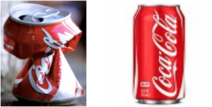
Analogy works well and the more vivid it is the better: “Imagine you are holding an empty Coke can in your hand. It’s not very strong. You can crumple that can in your hand. What you might not know is the skin of our aircraft is only 6 times the thickness of that coke can.”
Again a slide with a photo of a pair of coke cans will probably be much less sticky than the alternative mental imagery. Here is a pair of such cans – does this look sticky to you?
Crushed and intact coke cans
Slides may well be sticky: Pictures that focus on a particular point such as corrosion in a structure may get a high stickiness score. Charts of many sorts can work well, adding to comprehension and stickiness: graphs, histograms, pie charts, scatter charts, but often they are too complex, especially to those seeing the images for the first time.
Here are two simple tips: first remove all unnecessary detail, and second use the build facility in PowerPoint and similar packages.
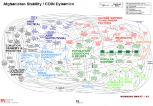
Better still, if the slide is complex, describe it in outline first with a blank (black) slide up, using the ‘B’ key if you have a keyboard, and the button on the clicker if you have one of those, so the listener is already building up a picture and then show them the slide. Here is an example of a terrible PowerPoint slide, which breaks almost every ‘rule’ in the book:
Then there are a whole host of other rhetorical tools that can be marched into battle to throw stickies, but not sticks at the listener. These have been covered in the winter 2013 edition, and a full list of Rhetorical Tools is available on the GPB website.
To many Australians a sweet dessert wine. is called a ‘sticky’ as the liquid sticks to the side of the glass due to its higher viscosity.
Whilst you’re munching through all that lovely food and drink over the Christmas holiday, and possibly having a ’sticky’ or two, have a think about what you plan to say in 2019 to your first audience of the year, and how you can make your contents stick to their ‘glassy’ memory.
Download a PDF of the article here: Stickies that Stick


